
Lien d’origine: https://codepen.io/Paul2512C/pen/zYYpBRZ
HTML:
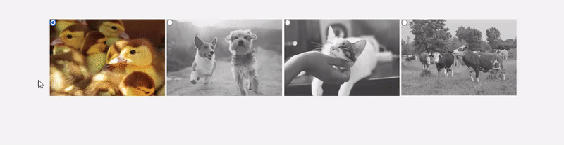
<section class="imgSelectorReflection">
<div class="images-selector">
<input type="radio" id="duck" name="image" value="duck">
<label for="duck" class="img-card img1"></label>
<input type="radio" id="dog" name="image" value="dog">
<label for="dog" class="img-card img2"></label>
<input type="radio" id="cat" name="image" value="cat">
<label for="cat" class="img-card img3"></label>
<input type="radio" id="cow" name="image" value="cow">
<label for="cow" class="img-card img4"></label>
</div>
</section>
CSS:
.imgSelectorReflection {
margin: 0;
padding: 0;
box-sizing: border-box;
position: relative;
width: 100%;
height: 90vh;
display: flex;
justify-content: center;
align-items: center;
background-color: #F5F5F5;
}
.imgSelectorReflection .images-selector input {
position: absolute;
z-index: 10;
}
.imgSelectorReflection .images-selector input:checked + .img-card {
filter: none;
transform: scaleY(1);
}
.imgSelectorReflection .img-card {
display: inline-block;
width: 250px;
height: 200px;
background-size: contain;
background-repeat: no-repeat;
cursor: pointer;
transition: all 200ms ease-in;
filter: grayscale(1) opacity(.8);
}
.imgSelectorReflection .img-card:hover {
filter: grayscale(0) opacity(1);
/* box-shadow: 0px 8px 4px rgba(0, 0, 0, 0.3),
0px 10px 2px rgba(0, 0, 0, 0.1); */
}
.imgSelectorReflection .img-card::before,
.imgSelectorReflection .img-card::after {
transform: scaleY(-1);
}
/*reflection*/
.imgSelectorReflection .img-card:hover::after {
content: '';
background-image: inherit;
background-repeat: no-repeat;
background-position: bottom;
background-size: cover;
width: inherit;
height: 40%;
position: absolute;
bottom: -25%;
}
/*fade reflection*/
.imgSelectorReflection .img-card:hover::before {
content: '';
width: inherit;
height: 42%;
position: absolute;
bottom: -25%;
background: linear-gradient(to bottom, rgba(255, 255, 255, .9),rgba(255, 255, 255, .5));
z-index: 1;
}
.imgSelectorReflection .img1 {
background-image: url(https://images.unsplash.com/photo-1442689859438-97407280183f?ixlib=rb-1.2.1&q=80&fm=jpg&crop=entropy&cs=tinysrgb&w=400&fit=max&ixid=eyJhcHBfaWQiOjE0NTg5fQ);
}
.imgSelectorReflection .img2 {
background-image: url(https://images.unsplash.com/photo-1548199973-03cce0bbc87b?ixlib=rb-1.2.1&q=80&fm=jpg&crop=entropy&cs=tinysrgb&w=400&fit=max&ixid=eyJhcHBfaWQiOjE0NTg5fQ);
}
.imgSelectorReflection .img3 {
background-image: url(https://images.unsplash.com/photo-1513360371669-4adf3dd7dff8?ixlib=rb-1.2.1&q=80&fm=jpg&crop=entropy&cs=tinysrgb&w=400&fit=max&ixid=eyJhcHBfaWQiOjE0NTg5fQ);
}
.imgSelectorReflection .img4 {
background-image: url(https://images.unsplash.com/photo-1549488235-42996ae3b650?ixlib=rb-1.2.1&q=80&fm=jpg&crop=entropy&cs=tinysrgb&w=400&fit=max&ixid=eyJhcHBfaWQiOjE0NTg5fQ);
}