
HTML :
<div>
<a class="c-preview">
<div class="c-preview__img"></div>
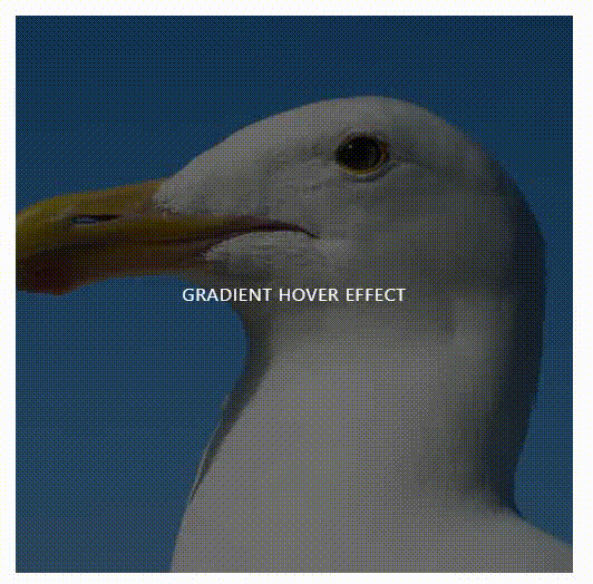
<h2 class="c-preview__title">Gradient Hover Effect</h2>
</a>
</div>
CSS :
<style>
    .c-preview {
        background: #000;
        background: -moz-linear-gradient(-45deg, #000000 0%, #000000 25%, #1e539e 50%, #ff3083 75%, #7800a8 100%);
        /* FF3.6-15 */
        background: -webkit-linear-gradient(-45deg, #000000 0%, #000000 25%, #1e539e 50%, #ff3083 75%, #7800a8 100%);
        /* Chrome10-25,Safari5.1-6 */
        background: linear-gradient(135deg, #000000 0%, #000000 25%, #1e539e 50%, #ff3083 75%, #7800a8 100%);
        /* W3C, IE10+, FF16+, Chrome26+, Opera12+, Safari7+ */
        background-size: 400% 400%;
        background-repeat: no-repeat;
        display: flex;
        width: 500px;
        height: 500px;
        max-width: 100vw;
        max-height: 100vh;
        justify-content: center;
        align-items: center;
        color: #fff;
        position: relative;
        cursor: pointer;
        transition: 0.5s all;
    }

    .c-preview__img {
        position: absolute;
        left: 0;
        top: 0;
        background: rgb(0, 0, 0) url(../../all-css/imgTest/7.jpg) no-repeat center center;
        background-size: cover;
        width: 100%;
        height: 100%;
        z-index: 1;
        opacity: 0.5;
        mix-blend-mode: screen;
    }

    .c-preview__title {
        position: relative;
        z-index: 10;
        text-transform: uppercase;
        letter-spacing: 0.05em;
    }

    .c-preview:hover {
        background-position: 100% 100%;
    }

    .c-preview:hover__title {
        text-shadow: 0 0 20px black;
    }
</style>