
Lien d’origine: https://codepen.io/TajShireen/pen/abzmoRE
HTML:
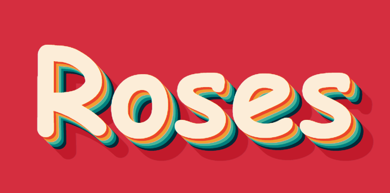
<section class="layeredTextShadow">
<div>Roses</div>
</section>
CSS:
.layeredTextShadow div{
font-size: 15rem;
text-align: center;
height:90vh;
line-height: 90vh;
color: #fcedd8;
background: #d52e3f;
font-family: 'Niconne', cursive;
font-weight: 700;
text-shadow: 5px 5px 0px #eb452b,
10px 10px 0px #efa032,
15px 15px 0px #46b59b,
20px 20px 0px #017e7f,
25px 25px 0px #052939,
30px 30px 0px #c11a2b,
35px 35px 0px #c11a2b,
40px 40px 0px #c11a2b,
45px 45px 0px #c11a2b;
}